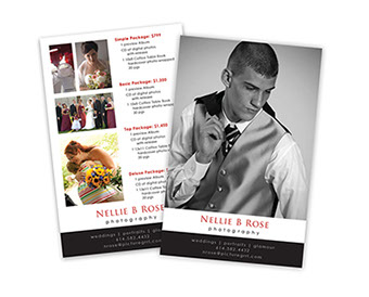



nellie b. rose photography
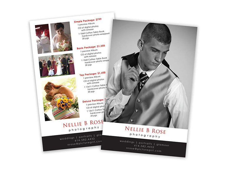
bridal show handout
A handout for a wedding photographer, showing samples of her work, and a breakdown of her most popular packages on the back.
All photography by Nellie B. Rose Photography, retouching by me.
Dearfoams
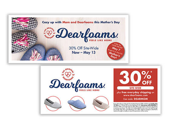
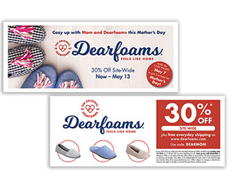
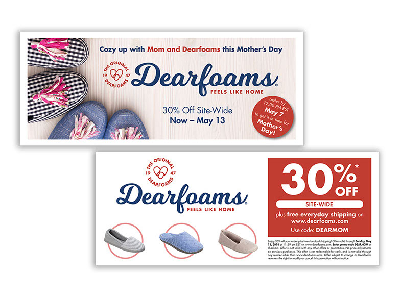
Spring ValPak Coupon
Classic ValPak ad, using selected photography from Dearfoams Spring 2018 photo shoot with popular selections from ‘evergreen’ (non-seasonal) style assortment on the back.
Baggallini
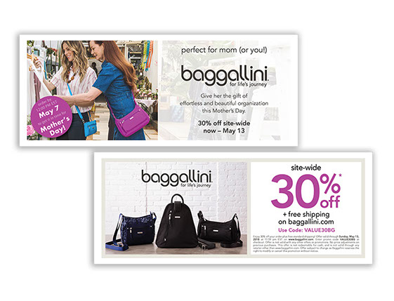
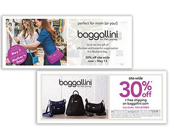
Spring ValPak Coupon
Classic ValPak ad, using selected photography from Spring 2018 photo shoot with popular selections from ‘evergreen’ (non-seasonal) style assortment on the back.
Collaboration with Leanne Mathys
baggallini
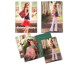
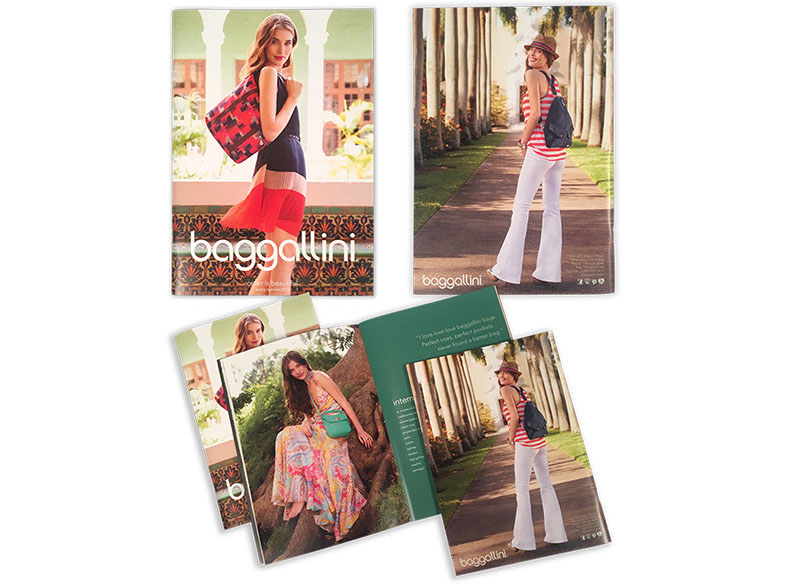
spring catalog
Full color saddle stitched catalog for retailers.
Tasks included:
- Minor photo touch ups
- Adjustments to the existing layout and styling via InDesign.
- Consolidated about 16 different paragraph styles into 6, making the most use of InDesign’s paragraph styles, with character style options if necessary for each section. This made the catalog much easier to set up for anyone tasked to do so in the future.
Dearfoams
.Com Card
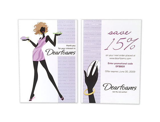
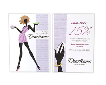
I was asked to design a promo card, calling out a discount on .com orders, and using the same general look as the recent annual report.
- Updated an existing fashion illustration (she then became a ‘sprite’, who would appear in corporate documents throughout the year)
- Added a quick new ‘hand on mouse’ illustration
- Ran a ‘benefit pattern’ down front and back of card, highlighting the individual benefits on the back of the card, where all the information was.
Walmart
Brand Revision Advertising
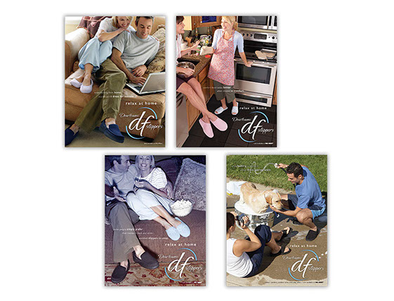
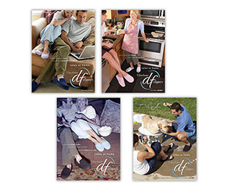
When I redesigned the Walmart brand for slippers in 2008 ($25 million annually), we were asked to advertise with Walmart for the first time – a 4 issue run distributed between Women’s First and Women’s World magazines. The ads appeared from March 2008 to June 2008 to prepare the Walmart shopper for the change in branding, which would hit the shelves in Fall 2008.
We (myself and the marketing manager) were given a budget of $5000.
The shoot was accomplished with 4 local models, using a team member’s home; all products shown (outfits, props, and, of course, slippers) were purchased at Walmart, to maintain the feel. The photo concepts and direction were mine, as was 75% of the photo retouching (time constraints forced us to farm out one photo for retouching).
Although the look of the branding has changed since 2008, DF by Dearfoams still hangs on the Walmart racks; the largest single consistent buyer for the company.
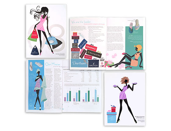
RG Barry corporation
Annual Report
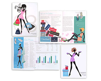
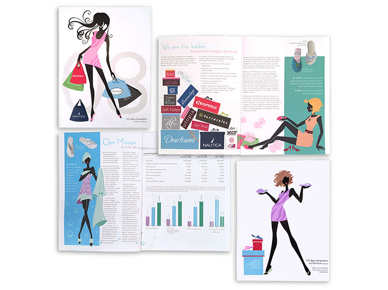
Full color perfect bound annual report for stockholders.
A fellow team member (Terre Brandon) and myself were asked to present concepts for the annual report layout. In the end, the shareholders liked both so much that we merged the two concepts.
Since the layout (column/grid) was closer to my concept, and there would need to be additional illustration, I was given the project to take to completion.
“Fashion & Fun” was the direction, with fashion silhouette illustrations (mostly by me), 4 column grid layout, and a whimsical handwritten font to start off each section.
Software used:
Illustrator, Photoshop, InDesign
Collaboration with Terre Brandon
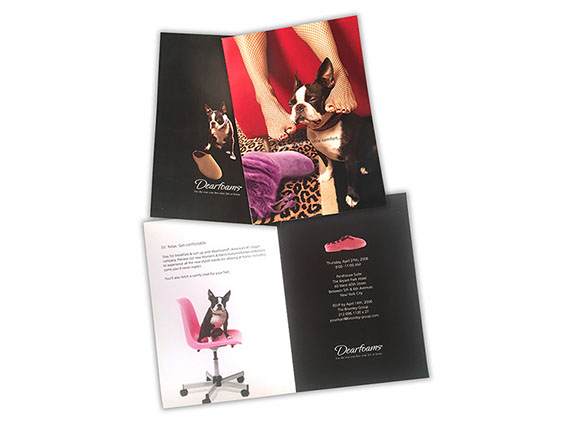
Dearfoams
Fashion Card
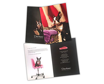
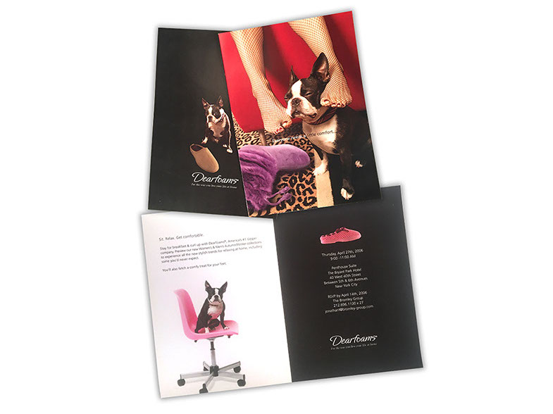
A fun, flirty little sales pitch, included with product and mass mailings.
Stock photography, product photography, and combining the two with Photoshop.
This was the start of using a pet along with the models; a couple of years later, Dearfoams would adopt an official ‘doggie mascot’ – but this was the prototype.
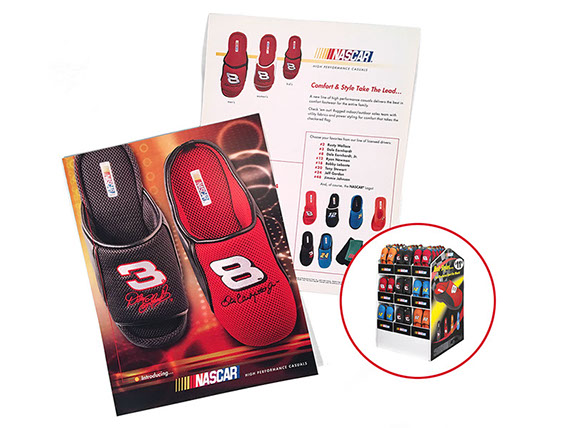
NASCAR
Licensed Program
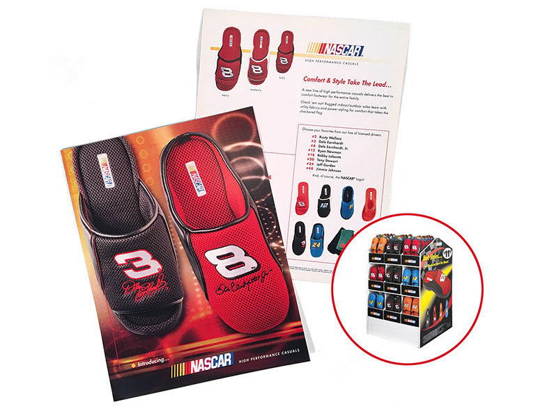
With the rise of NASCAR, RGB acquired rights to sell licensed product, under the NASCAR brand, into assorted retail stores.
Our department was tasked with creating some collateral materials for our sales force.
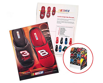
Specifics were: eye-catching, with a very brief illustration of the drivers we were licensed to sell, and photos of product.
The one-sheet to the left was the result. Stock photography as the background, blending 3 pictures together to create a brand appropriate (black/yellow/red) hi-tech background.
Also shown, the self-contained display I designed for Walmart (one of the main buyers). It shipped in fully stocked on a pallet, but could be broken down into branded PDQ trays for further sales on shelves or endcaps.


