



Spartan
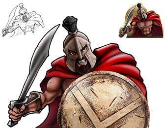
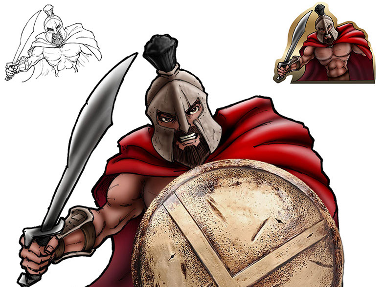
Corporate project/contest that paired me with collaborator Tara Potts (technical illustrator and digital painter).
The mandate was:
- Decorate a box to receive food donations for the Mid Ohio Food Bank.
- Box needed to reflect the name of the group.
- Name of the group had to be alliterative.
- The head of the group was Glenn, and so: “Glenn’s Gladiators".
Since it was just for fun, we were allowed to blur the whole Greek/Roman thing.
At the end of the day, we found a hi res photo of a Spartan shield, I drew my best version of Leonidas (from 300), and Tara colored him in.
We then put the illustration (upper right) BEHIND the box, with the partial shield in FRONT of the box.
The campaign was successful, as we got the most food donated.
Collaboration with Tara Potts
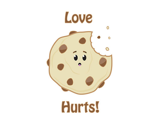
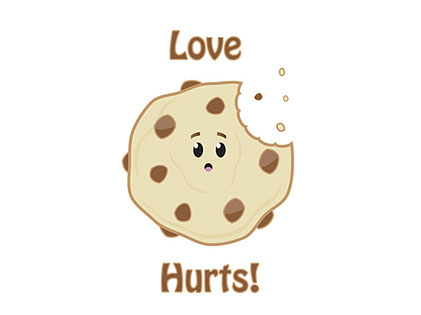
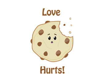
Love hurts
T-shirt design for a client.
They needed something that would work on Zazzle/CafePress.
Software used:
Illustrator
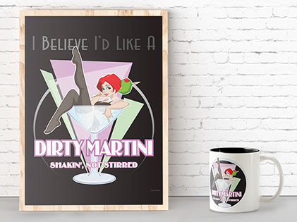
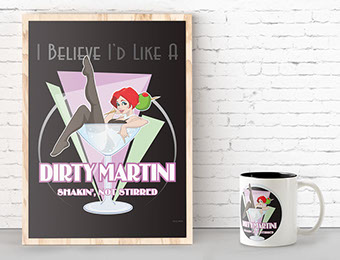
Dirty Martini
This was a commission for a friends bar/den/entertainment space.
The concept was:
- Cute, cheeky girl
- Somehow drink related
- Keep it PG-13.
After playing around with a few concepts, Dirty Martini was born.
She hangs now in his bar, and I had a mug made for him as well, just because.
Concept was sketched up and approved in pencil, then finished and colored on computer.
Software used:
Illustrator
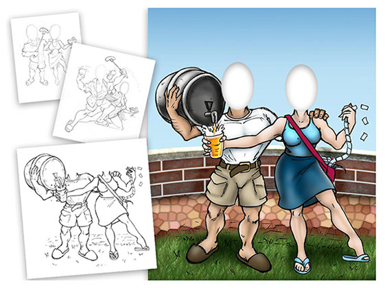
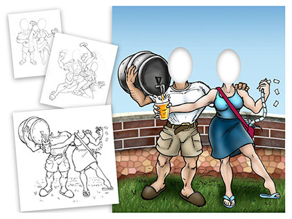
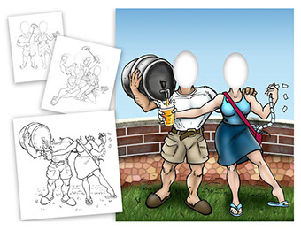
Summer Party Graphic
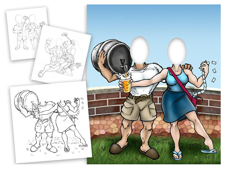
This was a fun collaboration between myself and Tara Potts, a technical illustrator and digital painter).
We were asked to come up with a cutout for a summer corporate function, and this is the result.
I did the concepts and inks, Tara did the coloring in PhotoShop, and I did a little bit of touch up here and there to bring it all together.
Hardware used:
Light box, and assorted mechanical pencils
Software Used:
Photoshop
Collaboration with Tara Potts
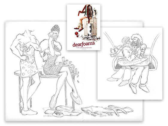
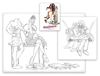
Storyboarding
For two years of the three year run of “Unexpected Moments of Comfort,” I had the opportunity to storyboard.
The concept was (as the photo suggests) that Dearfoams Slippers could provide comfort in the most unusual of circumstances.
The one caveat was to hide the face above a certain point, so as to curtail licensing fees.
Aside from the scenes pictured, I storyboarded:
- Surfing (flip flops)
- Scuba Diving
- Being carried off by a yeti
- Rain gear
And innumerable others – usually a couple dozen concepts per shoot, about 30% of which would make the cut.
Hardware used:
Assorted mechanical pencils
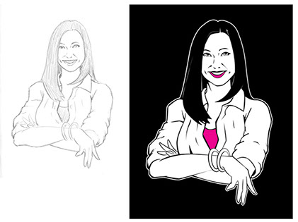
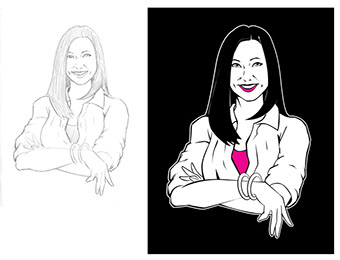
Digital tina
The founder/president of one of our brands wanted to be ‘illustrated'.
Specifically, she wanted to replace poor photography of her across the brand with a clean vector illustration.
Working from a photo, I put this together. First getting approval of the sketch, and then moving forward with the vector art (in brand colors, of course).
Hardware used:
Light box, and assorted mechanical pencils
Software Used:
Adobe Illustrator
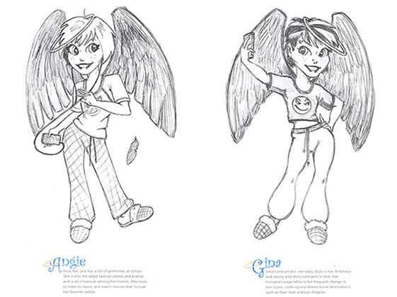
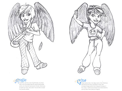
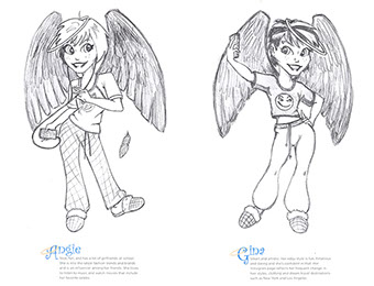
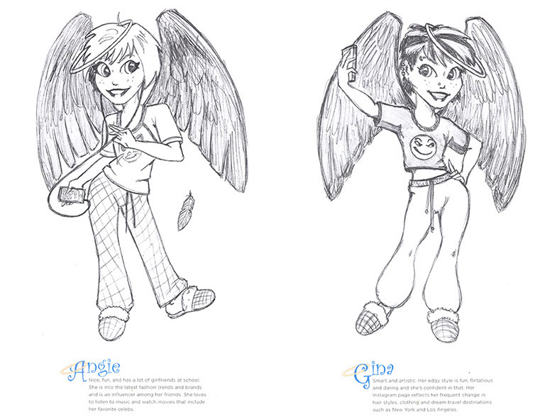
Angel Treads concept
I was asked to come up with a concept for our VP of Sales. Specifically, he wanted to see if we could add value/sales in our Walmart account, using an existing brand (Angel Treads), by repurposing the brand for a younger audience.
This would, ideally, be used to add sales in the 10-16 age group, where we were underrepresented.
Since each line of slippers had their own mood, we would likewise have ‘Angel Tread Tweens’ to represent those moods/archetypes.
Here are two of them, Angie and Gina.
Sadly, at the end of the day, there was a finite amount of money to work with, and it was determined that there was no budget for this.
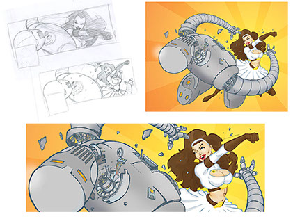
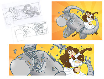
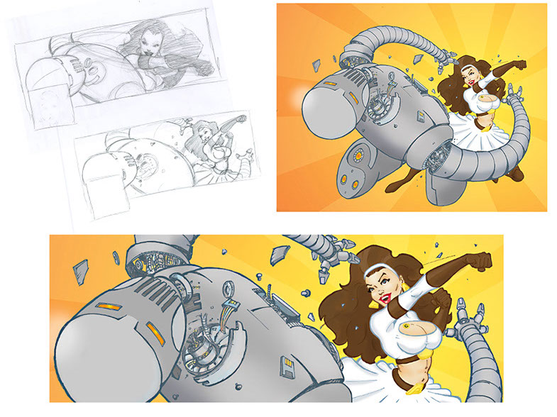
The mighty andromeda
This was an assignment/contest from an independent comics publisher in TX.
They wanted an illustration to use for their facebook page at that time. Their exact description was: "Andromeda punching a robot."
I submitted a couple of ideas (to the left in pencil), then inked in the winner. I did the coloring in Photoshop.
Final Facebook Graphic is bottom middle.
Hardware used:
Light box, and assorted mechanical pencils, copic multiliners
Software Used:
Adobe Photoshop


