
foot petals
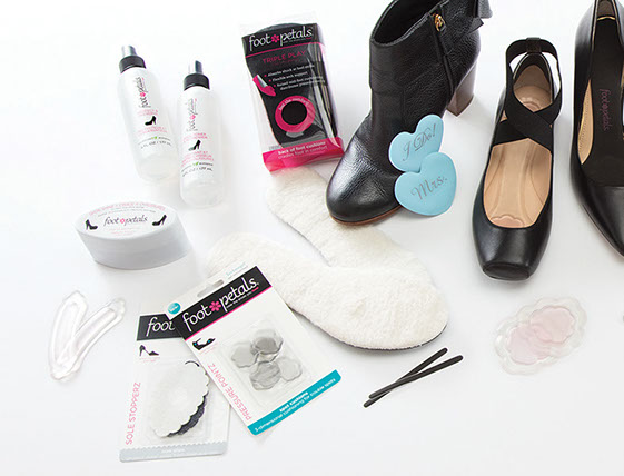
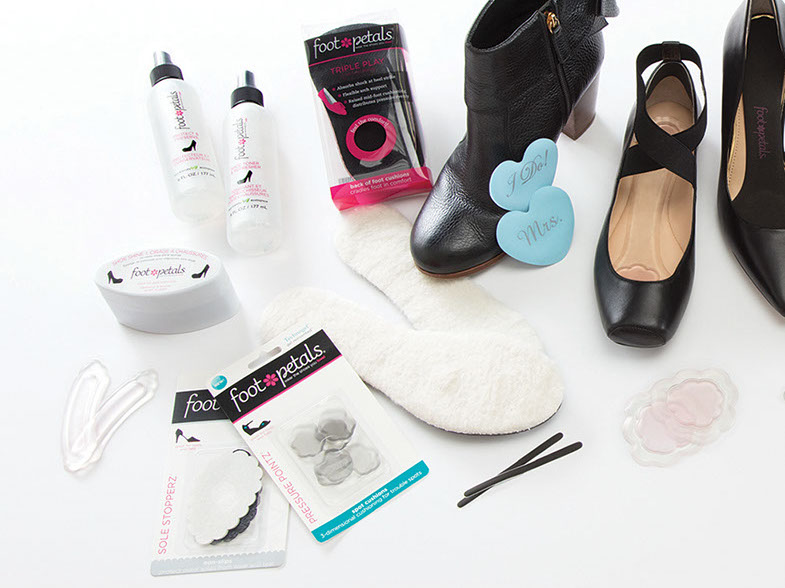
What can I say? Since we acquired the brand in 2012, I've handled EVERYTHING that Foot Petals has on the shelf, sub-brands included.
This is just a little sampler; blister cards, bottles, pvc box, and so on and so forth.
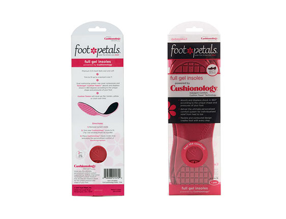
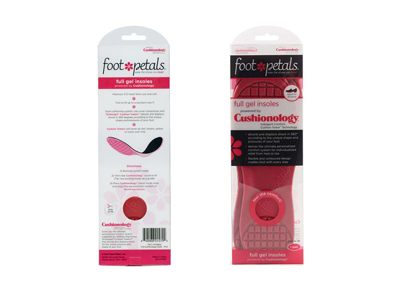
cushionology Insole
When Foot Petals developed a shoe with built in cushioning, it was only a matter of time before we would take the insole out, and use that (more or less) as a separate product.
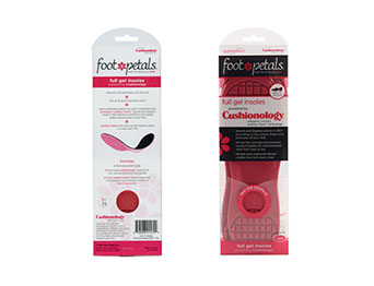
I was asked to provide a package for the new Cushionology Insole.
The structure is a standard PET box, adjusted to fit the product, with a locking tab on the bottom flap. Printing is a base layer of white for opacity, with black and pink printing over it. The illustration on the back is a freehand illustration based on sample product.
The technical illustration was hand drawn by me (with the additional caveat that I had to show both top and bottom surfaces so as to convey the gel plus fabric nature of the product), inked, then scanned into the computer and finalized in Illustrator.
nine west
I was given the opportunity to make a pitch for Nine West in 2017. Nine West liked my ideas, and we were given the license.
Since the slippers were of a generally higher quality, and a bit more delicate, I had proposed that we avoid damaging the product and keep to shoe boxes, and, if it was necessary to hang the product, a plastic hanger and hangtag combination.
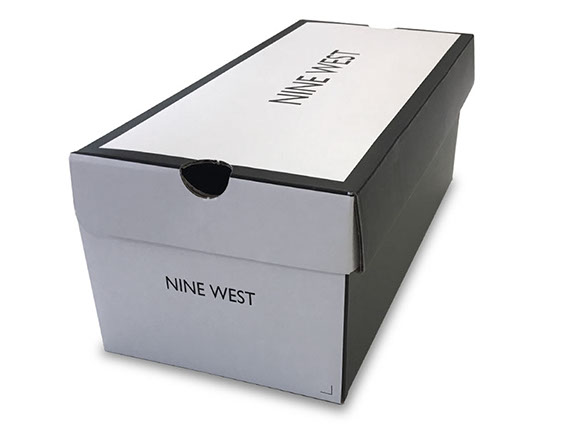
This is the Nine West branded shoebox, designed for stores such as DSW and Famous Footwear.
The box is a single piece of corrugate, with a heavy CCNB topsheet to cover up the corrugation. It is coated with a flood gloss UV, in keeping with Nine West’s branding standards.
If we had been looking at stores such as Payless, I would have constructed a 2 piece box. That being said, this structure, being one piece, and needing no glue, is less expensive and less prone to failure of any sort.
dearfoams 2016 rebrand
In late 2015 we had an outside firm do market and consumer research for us.
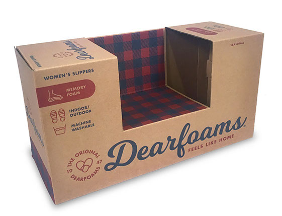
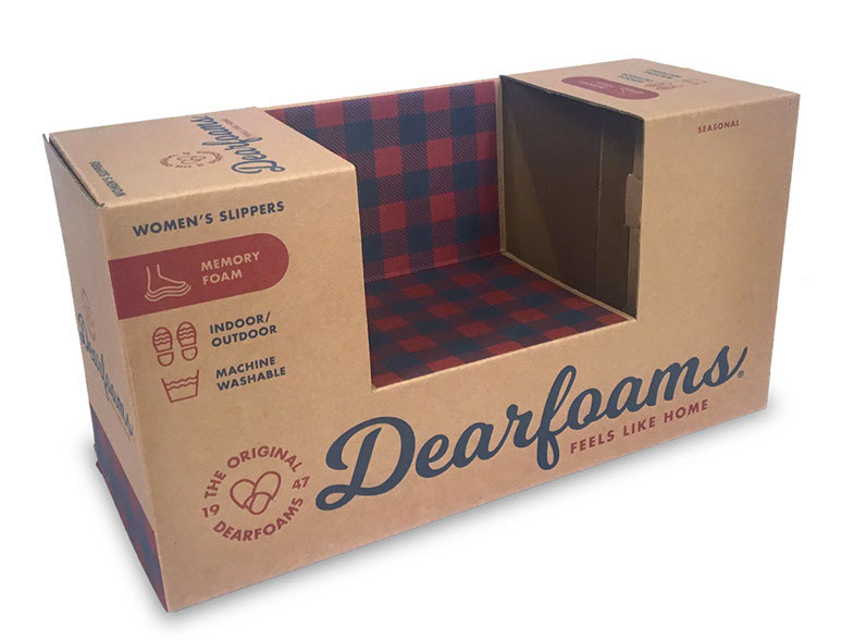
The result was the style of packaging you see here.
Craft surface, script logo (although more substantial than our previous script), with a quilted pattern as a primary branding element.
Rebranding that late in the season required me to make a trip to China to do on-site review of all updated and updating packaging, including boxes, chips, hangers, hangtags, labels, and nearly every other visible part of a selling unit.
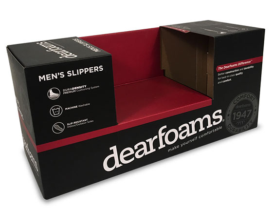
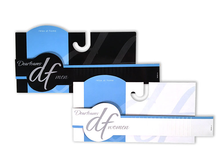
dearfoams men’s box
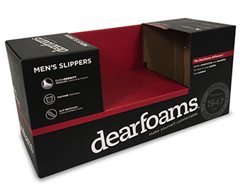
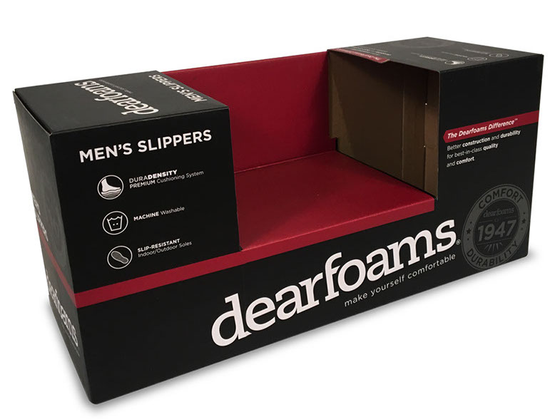
For Fall 2015, we were given permission to update and improve on DF Men's packaging. At that time, it was a flood red box, with white copy and branding.
We adjusted as follows:
- Modified the logo (slightly); the primary logo added a curved descender to the “f” in “dearfoams"; we changed that to a slab serif, matching the remainder of the logo, and making the logo a bit less feminine.
- Changed the base color to black, with red highlights (vs. flood red with white highlights).
- Added the “1947” seal
- Replaced UV Coating with Matte Film Laminate
We received a good response from primary buyers, especially Costco (up until that point, they had not bought much men's product for US stores). That year, they bought close to a million pairs of men’s product.
Collaboration with Ryan Beroset
Dearfoams Giftable packaging
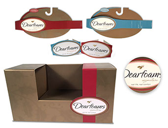
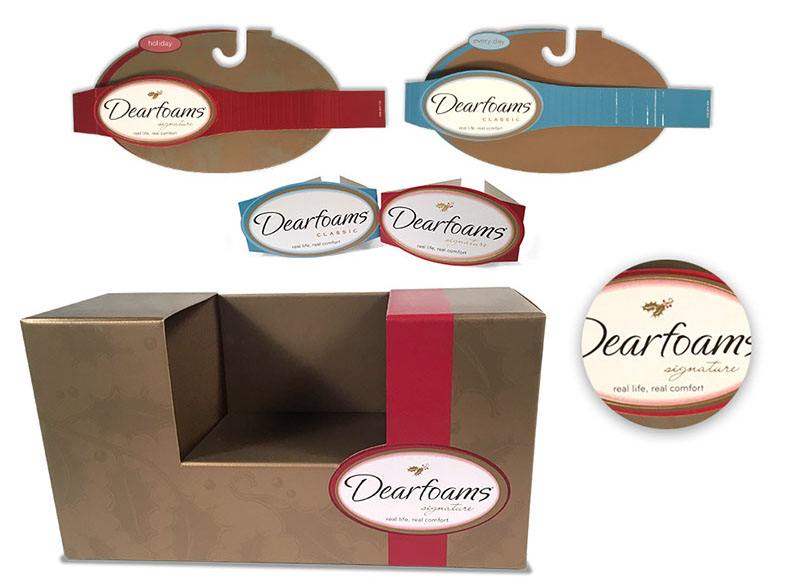
I was asked by our VP of Sales to simplify our packaging and make it more giftable.
Everything about these designs is toward that end.
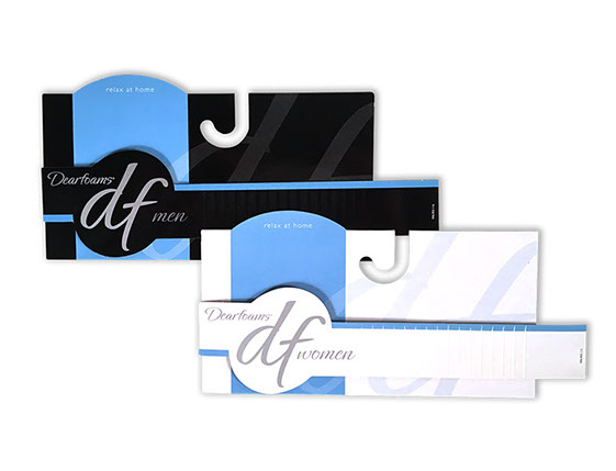
- We updated our chip and belly band to simulate a ‘ribbon’ on hanging product.
- For boxed product, we again replicated the ‘ribbon,’ wrapping it around the box as shown.
- For both hanging and boxed, the package was then ’sealed’ with the brand badge; Relatively basic for ’standard’ packaging (the brown and blue), but metallic with gold foil highlights for the seasonal/holiday.
- Hanging and boxed product for seasonal were embellished with a background pattern (simulating wrapping paper). In order to keep a Winter/Christmas feel, we opted for a simple holly pattern.
All of this was accomplished with only a $0.01 net increase in costing on hanging product, and only $0.03 for boxed.
Dearfoams DF for Walmart
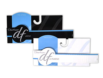
Walmart wanted a new brand. They wanted their OWN brand. And their $25 million dollar account was on the line if they didn't like it.
Most importantly, they wanted a closer association with the primary brand (Dearfoams).
Based on that, I went to work:
- Pulled the (then) current Dearfoams color pallete, and modified it ever so slightly so as to give Walmart a matching, but unique feel
- Incorporated the Ephesis script font into their branding, tying it back to primary brand
- Made the ”Dearfoams“ callout more prominent, bringing it to the ‘top’ of the brand
Walmart was quite pleased, and they have been selling a variation of DF by Dearfoams ever since (always keeping current with the parent packaging, of course).
baggallini Gift Box Concept
This was a fun little project.
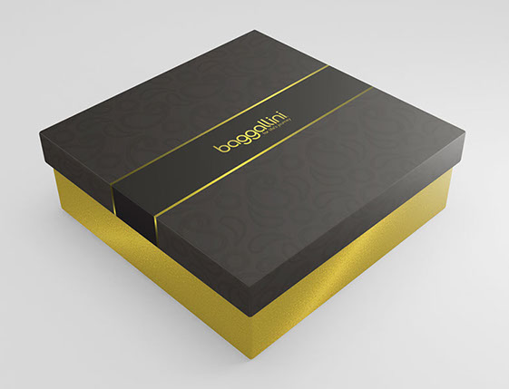
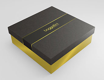
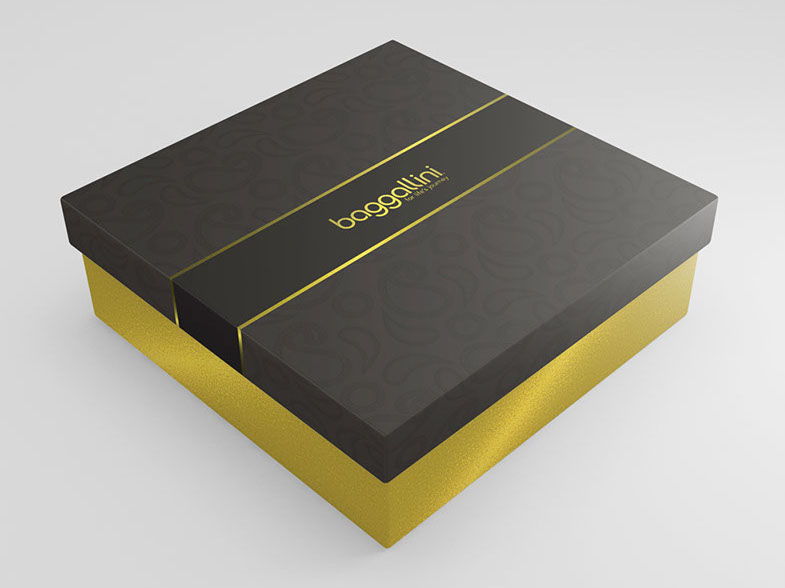
We had a product that was going to be pitched as a gift program, with more elaborate package than the usual baggallini hangtag combination.
The concept was:
- Setup box (not folding)
- Metallic gold paper laminate for the bottom of the box.
- Top of the box was warm black (Black 7)
- Gold foil highlights and logo
- Matte film laminate with UV Silk spot varnish (for the paisley pattern)
And, even with THAT, we still came in under budget.
Sadly, the targeted retailer did not decide to go forward with the program.

