


DF Sport logo
In making a pitch for Spring product to a club store buyer, we were surprised at the last moment when our women’s licensing agreement was dropped. Our sales associate was lamenting the inevitable loss of a sale, when the Visual Presentation team stepped in.
Reviewing the product (and the concept product for the following season) and discussing the ‘ideal’ usage with our design department, I came up with “DFSport.”
Zero to brand? Five hours.
The font, Bauhaus, was chosen to accentuate the lightweight, modern structure of the product. The colors, warm grey and a warm blue, were chosen to reflect Design’s ‘ideal’ market – lightweight, summer footwear; ideal for beach, or pool, or just wandering about.
The program was successful, and the brand lasted for some years, becoming especially popular with nurses (since the soles were EXTREMELY soft, light, and flexible).
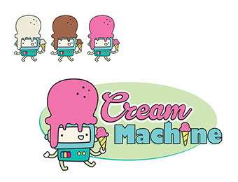
ice cream shop branding
Logo designed for an ice cream shop in MA.
Type was chosen to reflect a contrast between the organic (ice cream) and mechanical (robot mascot).
The colors were pulled from the client's robot illustration, with the original ‘red’ tone being a more purple hue. I modified it a bit to better reflect ‘strawberry', and then added the Neapolitan robots as an extra, just in case they could use them.
Gospel Vocal Ensemble Logo
Pro bono work for a personal friend of my wife. They needed a mark for their Gospel Vocal Ensemble at the local community college, and this is what I created for them.
The ‘V’ in the monogram incorporates the color of their choir robes which were worn in their public performances as an official arm of the college.
Gulf South Logo
Created for a client in Louisiana.
Their company does consultation and materials retrieval via drilling.
Based on that, we went with a modern, mechanical, geometric font (Futura), with colors designed to remain simple and striking, while calling to mind earth and water, with the inverted triangle as a drill icon, layered to reference the soil samples they collect.
Shown with spot color treatment and single color options.
Gulf South Logo (revised)
About a year after Gulf South put their new branding into practice (see previous entry), they merged with another company, and revised their focus.
Instead of focusing on core samples they would expand out to topography, surveying, water mapping and such.
This was the resulting logo.
- Kept Futura as primary font, but replaced the ‘drill/core’ icon with a surveyor's view, to reflect the new focus.
- Kept it simple, with blue as the primary highlight color, to reflect their continued focus on water related matters.
group rack logo
Developed for an IT professional who was setting up his own remote server service.
He specified the following conditions: simple, clean, and quick.
The logos represent the main treatment (3 spot or full process color), with basic single color options for times when budget or print technology might cause issues.
Delco Brand
Logo created for a local mobile carpet cleaning business.
Bold primary colors with large readable text ensured easy viewing in its primary environment (on the side of their vehicle).
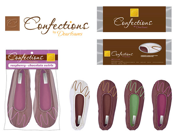
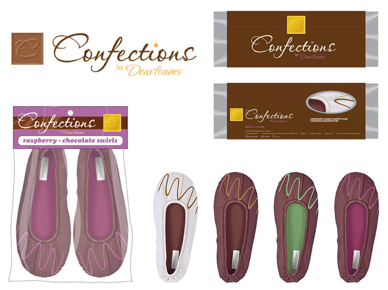
confections Concept
This was our first experiment with tight integration between product and packaging design.
Visual Presentation collaborated with Product Design to produce themed product that would marry seamlessly with packaging and branding of the same theme.
In this case, the theme was ‘candy’ – specifically, what if the slippers were marketed like fine chocolates (think Godiva, et. al.).

